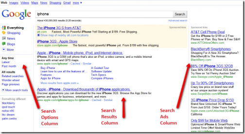
Google has officially rolled out an update to its search result pages, a three column design that provides search options on the left to help refine and redirect your searches. Spend a few minutes learning about the new features – this is the basic tool that shapes much of your online experience, every day.
I wrote up a short description of the new search options a few months ago. There’s a much more complete description here, with examples of all the different ways that the left column might help you improve your search results. There are three sections on the left:
- The top portion shows types of content that might fit your search. If you search for tidal waves, the search results will show web pages, images, and videos mixed together. On the left, you can filter the results with a single click to show only one kind of result – images, say, or videos. The choices for content filtering will change depending on what you search for – you might see shopping or news filters instead of images and videos, for example.
- The middle portion will filter the results in a different way. Frequently that will be an option to show results for a particular period of time – “Latest,” “Past 24 hours,” “Past Month.” But there might be other options – “Fewer shopping sites,” “Sites with images,” and the like. If you narrow your search to images, the middle section might let you choose between photos or line drawings or clip art, or pick colors that predominate in the image.
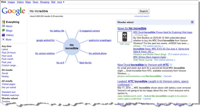
- The bottom portion will let you send the search out in a different direction. “Related searches” might get you closer to what you had in mind; a “Timeline” will extract interesting dates about your search item; Google’s “Wonder Wheel” shows related topics jutting out like spokes from a wheel, with search results on the right that change as you move from topic to topic on the wheel.
MOBILE SEARCH
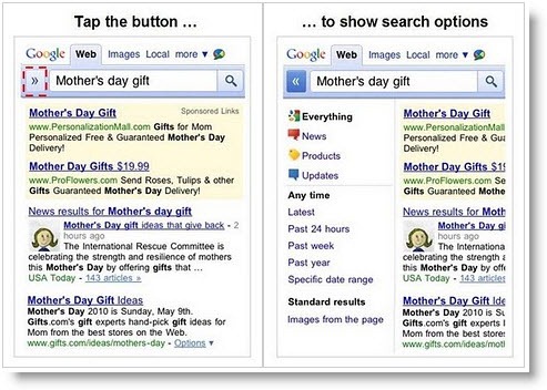
At the same time, Google added a new button to search results on iPhones and Android devices. Look for an arrow to the left of the search box; clicking it will drop down a menu that will offer some of the same search options you see above, formatted for a small mobile screen.
You’ll be amazed how quickly you can get to the information you need! Study the new layout until it becomes second nature – it’s worth it.


