Microsoft has introduced Office Web Apps, free online versions of Office programs that can be used entirely inside a web browser. Visit http://office.live.com to take a look at technology that will change our world.
That sounds breathless and exciting, right? It’s not hyperbole. You are living through a long-term shift away from dependence on individual computers and toward shared resources that live online and can be accessed from any of our devices, big and small.
The problem is that this first incarnation of Office Web Apps is pretty weak. You have to squint to see the future from here.
WINDOWS LIVE ID First, an introductory note. You will have to sort out your Windows Live ID, the free Microsoft account tied to your email address; you’ll use it to gain entry to Office Web Apps, like most online Microsoft services. Here is some information about setting up and using a Windows Live ID.
When you visit http://office.live.com and log in with your Windows Live ID, you can use Word, Excel, Powerpoint, and OneNote in a web browser – any browser (Internet Explorer, Firefox, Chrome, Safari), on both PCs and Macs. The apps are free and do not require the full version of Office. You can store files online using Microsoft’s integrated Skydrive file storage, which offers 25Gb of free storage space.
Microsoft has a huge advantage over Google Docs and other competitors: Office Web Apps use the native Office file formats and files created or edited online will display completely accurately in the desktop Office programs. A file will make a round trip without losing any formatting characteristics: a heavily formatted Word document from your desktop can be edited online in the Web Apps, then returned to your desk with all formatting intact. It will not likely survive a similar trip through Google Docs.
I’m going to list a number of shortcomings of the current version of Office Web Apps, but I don’t want you to use that as an excuse to look away. This is a powerful tool that will improve over time and is completely usable right now. It deserves your attention. I want you to try the apps and learn about them! There will be a quiz next period.
With that in mind, here are some of the things that I’ve noticed.
- The online editing tools are not very deep, although that’s not a huge problem – many times we don’t need much more than boldface and bullets, right?
- The controls for working with files are not going to strike anyone as intuitive. Some of that is unavoidable when you think about it – the whole point is to have options to display a file online, open it for editing online, or open it for editing in your desktop Office program. Still, something about the current setup leaves me cold; I can’t imagine how it will look to someone whose head is not already tuned into these services.
- Some shortcomings are just odd. The one that jumped out at me: only one document can be edited at a time; you have to close a document to get to another one. No side-by-side work in the web apps!
- Another quirk – not a shortcoming but it may strike you that way if you get it wrong. The Word app does not save work in progress. If you don’t hit the correct Save button when you’re done, work might be lost.
- The whole system is noticeably slow at times. Moving from screen to screen, saving files and closing them, opening complex files – it might only be a second or two but it feels sluggish compared to the lightning-quick Google Docs system.
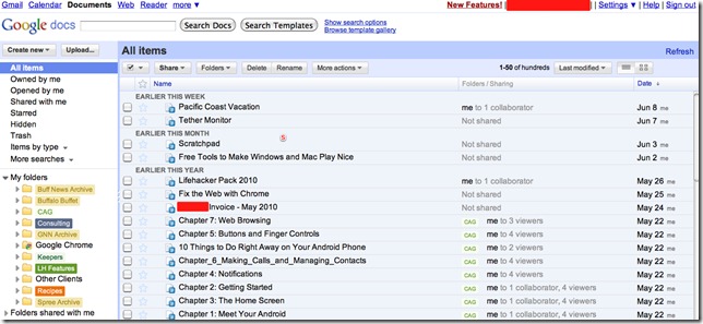
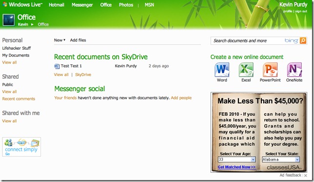
- The landing screen is built around the larger Windows Live ecosystem, for better or for worse. A few months ago I compared the pages used by Windows Live Skydrive and Google Docs for displaying photos, where Google’s barebones look suffered, but it turns out that plain lists are more efficient for working with documents at times when you don’t really care what was recently posted on FriendFace. The pages you’ll see from Microsoft are cluttered (and the ad in the lower right corner is really hateful). Compare these screens from Google and Microsoft:
All the controls are there on Microsoft’s page (and more traditional file lists are only a click away), but it’s not a great first impression.
The most important shortcoming, though, is the process for getting files to and from the online file storage in Skydrive. I’m really unhappy about it. I’ll talk more about that in another article.
Here’s a good overview of the good and bad features in Office Web Apps, and here’s a nice comparison of Office Web Apps and Google Docs. Go take a look, try it out, and let me know what you think!
[Addendum 06/15/10 11:19am: This article highlights more shortcomings in the interface and menus and points out a few maddening things that I hadn’t noticed. Microsoft will keep plugging away but this has already been in development for a long time and I expected a better rollout.]


Trackbacks/Pingbacks