The iPad was not the first tablet on the market. Microsoft was one of the first companies to deliver a tablet, with the first prototype demonstrated more than ten years ago. No one cared.
Apple created the demand for the iPad more or less from scratch, leaving Microsoft looking completely helpless. For a while it plaintively complained in interviews, “Hey, there are Windows tablets, too,” but eventually the Microsoft spokespeople lapsed into sullen silence and let Apple run away with the tablet market. Microsoft still shows no sign of a coherent tablet strategy. It periodically claims that it will have a great tablet OS eventually but the promises get more vague and dates are delayed over and over, as if it’s having trouble thinking of something – anything – that might be interesting.
I don’t know if it’s promising or just weirdly ironic that the Bing team at Microsoft has just released one of the best designed iPad apps on the market.
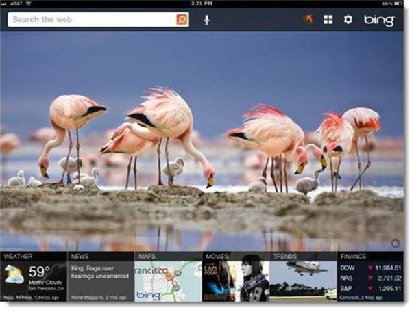
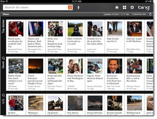
Bing is Microsoft’s competitor to Google for web searches, but the Bing app for the iPad is not just a search page. It’s a beautiful, intuitive app with tiles for news headlines, weather, maps, movies, and trends. Each opens up into a nicely designed screen suited to the type of content. The news pages have scrolling tiles with headlines and pictures; the movie pages provide easy access to previews, reviews, and local showtimes.
There is a search bar always visible and the app can be used as a kind of lightweight web browser. It doesn’t have all the features of a full-fledged browser (no bookmarks, for example), and it is walled off from Safari, apparently because that’s the way Apple declared things must be. The app makes natural use of swiping left to right to go back through the places you’ve been – a natural alternative to tabs or history in a web browser.
The search bar features a microphone icon; it sends spoken phrases off to a server in the sky and does a remarkable job of recognizing your words correctly for web searches – apparently the same trick used by Google for Android phones.
The Bing app might become the first thing you open you pick up an iPad. It’s not as deep as the New York Times or as fluffy as The Daily, but it has a visual richness and enough content to make it a compelling way to take a quick look at the world. There are more screen shots in the official announcement from the Bing team – take a look! It’s gorgeous.
Spend a couple of minutes watching a very excited review of the Bing app by Chris Pirillo. Keep your eyes open for the moment when he compares the Bing app to Google’s app for the iPad. Google’s effort was strikingly weak already and the Bing app delivers a knockout blow.
Where did this app come from? Can Microsoft bring the same skills to developing an entire tablet OS? This is so good it makes me want to reconsider Bing for web searches on the computer. We are so trained to use Google that it’s easy to dismiss Bing but in fact it’s been gaining market share (reportedly 30% of US searches, according to a survey released yesterday). Bing has some tools that are far better developed than Google for certain things – travel and shopping, for example – and the beautiful photo used as the background on Bing each day is quite nice. (I’m getting a little burned out by Google’s overdone cute doodles to celebrate obscure events. Google’s logo was changed on April 3 because it was the 119th anniversary of the first ice cream sundae. Seriously. It’s starting to be distracting, not cute.)
If you don’t have an iPad yet, think of this as a teaser, one reason you might want one. Watch the video and see if you don’t find yourself starting to get interested.


