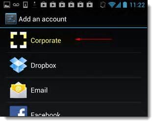
For the last few weeks, I’ve been using Android for the first time on my new OnePlus One phone, after two years with a Windows phone. Many of you have far more experience than I do with customizing Android and choosing apps, but I’m going to share some of what I’ve been looking at in the first few weeks anyway, in case it gives you any ideas.
Most of my small business clients use Office 365 hosted mailboxes running on Exchange. The built-in mail, contact and calendar apps in iOS and Android connect to Office 365 mailboxes and work perfectly. Most people never investigate anything else. Tap on mail and see your mail; tap on calendar and see your calendar: stop, end of story. That’s a good result and as far as most people need to go.
There are, however, some apps that work with Office 365 and Exchange that might help some of you accomplish something specific that the stock apps can’t do. Here are three examples.
Acompli
Microsoft has developed phone and tablet versions of Word, Excel and Powerpoint, but it does not have an app-sized version of Outlook for Android or iOS (with the limited exception of OWA, discussed below). That may be what emerges from Microsoft’s acquisition last month of Acompli for $200 million. You can try Acompli now for free on Android or iOS and see what Microsoft is starting with.
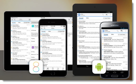
The message display is similar on most of the mail apps. Acompli uses a smart algorithm to sort messages into “Focused” and “Other,” so you can focus on mail from people in your Contacts folder and messages that might be important, with newsletters and ads kept out of sight. Messages aren’t moved in your mailbox; it’s just a change in the way they’re displayed in Acompli. It works surprisingly well but you don’t have the ability to change things that you think it gets wrong.
The real heart of Acompli is its integration with your calendar, allowing you to check availability for a meeting or choose a new proposed meeting time with a single click. Drag a message to the left and it can be turned into an appointment. You can view your calendar with a couple of clicks (not a single click, like you’d expect), but there’s also a calendar icon in the window when you compose an email so you can check your schedule or create an invitation to a meeting.
Acompli gathers together your email attachments in a “Files” section so they can be easily accessed or re-used. Acompli does not display all of your contacts or any of the contact information displayed in Outlook, but it does pull “important” contacts in a list that theoretically brings people to the top that you communicate with most often. The files and contacts features are quirky and I didn’t find them very useful.
It’s not obvious what caught Microsoft’s interest. Microsoft already has sophisticated techniques running in Outlook.com for sorting mail so that newsletters and social updates do not clutter up your inbox. Acompli’s calendar integration might be interesting for large enterprises that are heavy users of Outlook’s meeting and appointment features, but the lack of contact information and quirky interface did not convince me to switch to Acompli for long.
OWA for Android
OWA for Android is a “pre-release” Android app from Microsoft introduced last summer, available if you have a business Office 365 Exchange mailbox and a relatively recent version of Android. (To be clear, this is not for anyone with an Outlook.com mailbox or an Office 365 Home or Personal subscription.)
OWA for Android looks exactly like a mobile version of Office 365 webmail, with its clean and modern uncluttered appearance. In fact, that’s more or less what it is, but with two things that make it better than visiting http://mail.office365.com on your phone: it memorizes your credentials so you don’t have to log in every time; and it downloads your mail, contacts and calendars so you can use them when you’re offline.
It’s an attractive app with a couple of shortcomings.
• If you click on a message to display it, there is an icon at the top to reply/reply all/forward, and icons at the bottom to delete it or move it to another folder – a nice touch. But for some reason it’s not possible to do anything from the list of messages without clicking into each one. A long press on a message does nothing. Sliding the message header to the right is supposed to display icons to reply or delete but it’s almost impossible to make it work.
• There is no way to turn an email message into a task or appointment.
• And the cardinal sin: it is slow. It appears to connect and update the information when it switches between mail, contacts, and calendar, leaving a blank screen for a few seconds, just enough to make you uneasy.
OWA for Android is well worth a look for Office 365 subscribers. It looks better than the native Android apps for mail, contacts, and calendar, and it makes sense for all your Outlook data to be in one app.
Touchdown
Touchdown is old and creaky. The interface is antiquated. It was purchased by Symantec’s mobile division in 2014 and appears to have been abandoned, with no updates for almost a year. It’s too expensive, at $19.99. It’s overly complicated with too many confusing options.
Touchdown is also the app that I’m likely to continue using on my phone.
Start with the basics. There are two versions of the Touchdown Android app. The one you want on new phones is “Touchdown HD,” which appears to be for tablets. It turns out also to be the right choice on phones running any version of Android released in the last four years. When you look for it in the Play Store and get to “Touchdown for Smartphones,” you’re looking at an app originally designed for Android 2.0 and now replaced by “Touchdown HD.” Maybe it’s not a replacement. Maybe the two apps are identical on phones. I can’t tell.
That’s not all. Buying Touchdown requires a convoluted process unlike any other app. After a thirty-day trial, you won’t buy a license from within the app. Instead, you have to go back to the Play Store and buy a license key. Don’t get a key until you’ve installed and configured the app! It won’t go well.
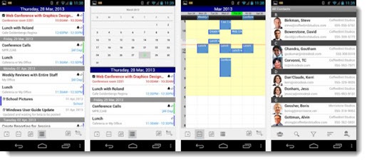
Touchdown incorporates a great deal of Outlook’s complexity, for better or for worse.
Here’s an example. A long press on an email message in the list brings up these options:
• Quick reply
• Speak
• Mark as read
• Mark as unread
• Delete
• Move to junk
• Move
• Reply
• Reply All
• Forward
• Make task . . .
• Make event . . .
There are similar long lists of options for a long press on a contact or appointment.
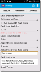
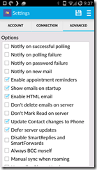
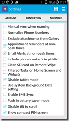
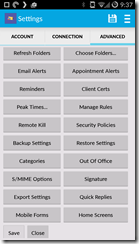
Here’s another example. These four screens are all under Settings / Advanced. The fourth screen is a long list of buttons, and each button leads to more options. And there are still more choices in each of the individual sections – email, contacts, calendar, and tasks.
I know. It’s absolutely absurd, isn’t it?
And yet . . .
For years I’ve been managing my inbox using Michael Linenberger’s method of converting messages to tasks. My Outlook task list is carefully configured and controls my work agenda.
Touchdown is the only Android app that can be configured to work with that task-based system. Here’s my article about how to configure Outlook to take control of mail and tasks, and here’s Mr. Linenberger’s explanation of how to configure Touchdown to use his system.
That makes Touchdown a very specialized app of little interest to anyone except the few people who use Outlook tasks. At the moment, the integrated tasks are important enough to me that I’m putting up with its quirks.
There are other Android apps for Exchange, of course – MailWise, Nine, CloudMagic, and many more that might be better than anything I’ve tried. I’m using Contacts+ for looking up phone numbers and sending email messages.
Most of you don’t need to change anything. The default apps for mail, calendar and contacts are perfect choices for you. Just keep in mind the variety of choices if you feel anything is missing. You might be able to find something that works exactly the way you want it to work.


Your description of Touchdown is spot-on. It’s one of those apps I love to hate. Can’t live with it and can’t live without it.