Previously: Part 1 – the first five annoying things
I’m a big fan of Windows 10 but it’s not perfect. Here are five more things that make me a bit crazy.
6) Control Panel vs. Settings
Microsoft introduced a modern-looking Settings panel in Windows 8 and half-heartedly moved a few things to it from Control Panel. It was badly done but the implicit promise was that it was the beginning of a concerted effort to move all system controls to the new Settings panel so that Control Panel would be nearly gone in the next version of Windows.
That didn’t happen. There appears to have been little progress in the last three years.
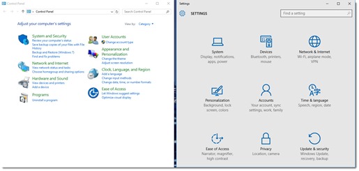
I defy you to look at the two screens above from Windows 10 and tell me that you feel confident where to click to change the screen resolution, or add a user account, or change network settings. If you want to check on a printer, should you click on Control Panel / View devices and printers or Settings / Devices – Bluetooth, printers, mouse? Think of it as a fun and interesting game, because you have absolutely no way to know which one will be helpful.
The old Control Panel and the new Settings app are duplicative and confusing and disorienting. Some options are in both, some are in one or the other, and some choices bounce you back and forth between them.
Here’s an experiment. Want to change your wallpaper on a Windows 10 computer? Right-click on the screen and click on Personalize. A streamlined panel will come up in the modern Settings app to choose Background and Colors. So far, so good. But if you want to use one of Microsoft’s dazzling Themes, the free collections of photos that you can use as rotating wallpaper, click on Themes / Theme settings – and bam! you’re launched unceremoniously into Control Panel.
The good news is that system-related tasks are heavily indexed. Click on Start and type almost anything and you’ll be led quickly to the right place. Avoid searching manually through Control Panel and Settings – they’re hopeless.
7) File explorer is cluttered
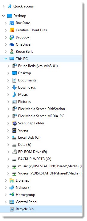
The above picture shows the left panel of File Explorer on my office computer. It’s a mess! It’s an unholy mish-mash of add-ins for cloud services (Box, Adobe Creative Cloud, Dropbox, OneDrive), media devices on my local network (VM-WIN8-01, Plex Media Server), an oddball entry courtesy of the Fujitsu Scansnap scanner, my user folders (Documents, Desktop, etc.), mapped network drives, and more. Every time I open File Explorer, I have to scroll to find the C: drive on my computer. I’m not using many of those items but there they are, cluttering the view.
It’s possible to clean up the display and remove the least useful items. I’ll write a tip about that soon. Just know that you’re not alone if your first impression is that File Explorer seems more complicated than it used to be.
8) The notification center isn’t very useful
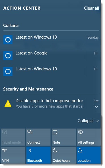
Microsoft still doesn’t know what to do with the right side of the screen. Windows 8 introduced the Charms bar, which was intended to be used constantly for everything from printing to shutting down the computer. Instead, it was misunderstood and mostly ignored. Many Windows 8 users forget that it exists.
The failure of the Charms bar caused Microsoft to retool the right side in Windows 10, transforming it into a notification center.
At the top is the Action Center, which displays notifications – perhaps new email in Outlook, or news items from Cortana, or suggestions for system maintenance. Among other things, it collects the notifications that appear briefly down in the lower right corner so they can be reviewed later.
Interesting idea. I’m mostly ignoring it. I suspect many Windows 10 users will forget that it exists.
At the bottom are toggles for various settings. On a desktop computer, they’re pretty useless. I guess it’s convenient on a laptop to have an easy toggle for airplane mode, or a way to turn tablet mode on and off for a Surface with a detachable keyboard – although that happens automatically so the button is rarely necessary. That’s about it. It’s a lot of screen real estate used to little purpose.
The notification center can be extensively customized, if you enjoy doing that sort of thing. I don’t see anything in the customization options that makes it look much more exciting. I’m going to keep ignoring it.
9) Multimedia Devices multiply like rabbits
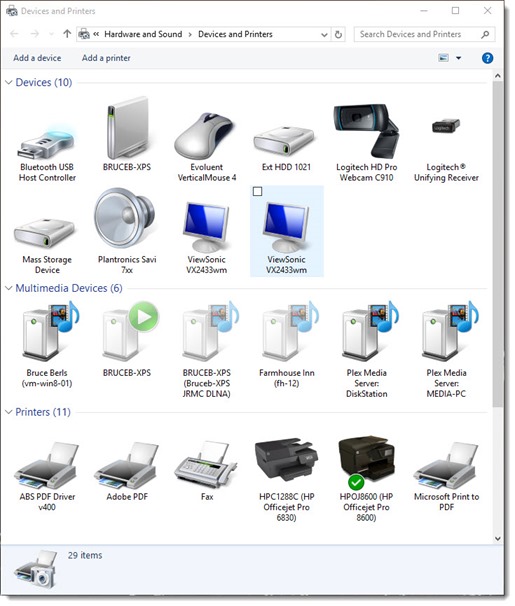
There are frequent reasons to check on printers in Control Panel. The picture above shows the Devices and Printers folder on my office computer.
See that middle area? It’s full of “Multimedia Devices.” It collects devices on the network that are busily offering to share media content using a variety of protocols that you don’t want to know about. (Seriously. Trying to figure out DLNA is something like trying to study linear algebra but without the fun parts.)
There are two things about Multimedia Devices.
One is that I’ve never, ever found anything useful to do with a Multimedia Device in Control Panel – except remove the ones that don’t really exist, because once your computer has met a Multimedia Device, it never forgets it. If a friend brings a laptop for an hour and uses your wireless, chances are good that you will see your friend’s laptop under Multimedia Devices forever more.
The other is that you can’t get to Printers without scrolling past the useless Multimedia Devices section. Maybe it’s because the sections are in alphabetical order but every time I have to check on a printer, hoo boy, do I hate the Multimedia Devices.
The whole idea of Multimedia Devices is increasingly irrelevant in a world where we obtain our media by streaming it from online instead of finding it on networked computers. I don’t mind if the devices are listed somewhere but I wish they weren’t in the way when I’m trying to work on a printer.
10) Smiley face icons
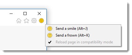
The picture above shows the upper right corner of Internet Explorer in Windows 10.
There’s a smiley face.
I don’t want to look at the smiley face.
Microsoft thrives on feedback. Much of the data fed back to Microsoft from your computer – the stuff that allegedly invades your privacy – is used quite anonymously to fix bugs and learn which features you use or don’t use.
The idea is that you can send feedback to Microsoft by clicking on the smiley face when something happens in IE that you like or don’t like. Clicking on “send a smile” brings up a screen where you can type a comment and optionally provide your email address.
Microsoft has been adding smiley faces to Office for several versions now, mostly during the previews of new releases. I had been looking at smiley faces in Word and Excel for quite a while before they finally disappeared in the last few weeks from my copy of Office 2016.
Feedback is valuable. I’m confident that Microsoft reads the comments and does really interesting analysis of millions of comments to drive product development.
My problem is, I hate looking at the stupid smiley face. It’s unprofessional. It’s very yellow. Something about “send a smile” makes me shudder. I know, it’s petty, but you know what doesn’t have a smiley face? Google Chrome doesn’t have a smiley face. ![]()
Bonus Windows 10 annoyance – Wi-Fi Sense
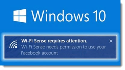
When you look for wireless networks in Windows 10, some of them will say “Wi-Fi Sense” and some of them won’t. It’s a new feature that automatically connects you to safe public networks. Or maybe it shares access to wi-fi with your trusted friends. Or maybe both. It’s a terrible security risk. Or maybe it’s not.
I’m still trying to figure it out. I can’t make sense of it yet. I’m inclined to think that it’s like Homegroups – well-intentioned, potentially helpful, and way too complicated to be worth paying attention to.
Other than those things, I have no complaints about Windows 10. Well, yes I do. There are always more things to complain about. But don’t let this list distract you from much more important fundamentals: Windows 10 is fast, stable, secure, and compatible with a huge ecosystem of programs, hardware, and online services. Use it happily!


Hi! I have multiply devices in Control Panel. It is crazy. I deleted many of them, reset the laptop and they appeared again and again…….
Yeah, me too. I’ve pretty well given up.
Hi, maybe you can help, for even though I’m a techie, I’m currently stumped. Yesterday I re-booted the computer, and now all of a sudden, I am seeing 315 (yes, you read that correctly) instances listed under my multimedia section. So there are a multitude of grayed-out dupes, which should only list two or three (our Amazon firesticks). Have rebooted, ran all kinds of diagnosis programs, registry, well…you name it, all to no avail. And yes, rebooted the router too. Nothing. I can’t delete these either. First time it’s ever happened. HELP!
Running Win 10 Prof.
Wow! That’s a new one. I’ve never run into that problem. There’s something odd about the display in Control Panel / Devices & Printers in Windows 10. Lately I’m frequently seeing lengthy delays before it displays, for no apparent reason. I had to wait 90-120 seconds to view printers on a client computer yesterday – just odd, not sure what that’s about. Sorry, I don’t have anything to offer for duplicative media devices. Good luck!