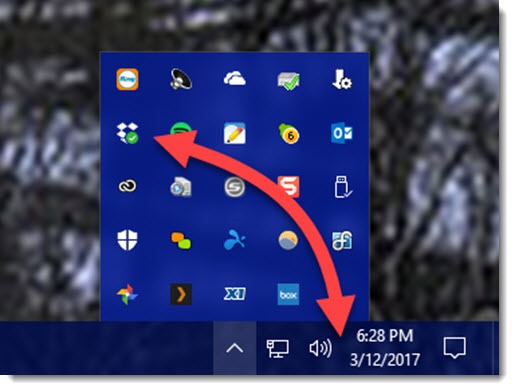
Want to see an icon in the notification area on the taskbar? Drag it from the overflow area and drop it where you want it.
Want to keep an icon out of sight so it doesn’t take up any space? Drag it up from the notification area and drop it in the overflow area.
That’s it. That’s the tip. Might be the simplest tip I’ve offered.
But take a second and appreciate it. It’s one of the more lovable small touches that Microsoft tucked around the edges of Windows 10.
The notification area is on the right of the taskbar. A few icons are typically visible all the time – the network/wifi icon and the volume icon are pretty standard. Many other programs leave icons down in the lower right – some visible, some out of sight in the overflow area. The “overflow area” is the popup bubble that displays icons for running programs and services when you click the up arrow.

You’ve been able to adjust which icons are always visible and which are hidden ever since Windows XP, but the settings have been moved in Windows 10.
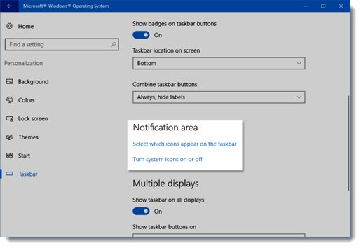
To adjust the icons displayed in the notification area in Windows 10, right-click an empty part of the taskbar and click on Settings. (Or click on Start / Settings / Personalization / Taskbar.) Then scroll down and click on Notification area / Select which icons appear on the taskbar. Turn an icon “on” for it to appear all the time, “off” for it to be tucked in the overflow area.
I was surprised to find that the icons can be dragged from one place to another in Windows 10. When you drag an icon from the taskbar to the overflow area, it’s the equivalent of turning the icon “off” in Settings. Dropbox, for example, tends to make its icon always visible. If you don’t need to see it all the time, drag it off the taskbar. It’s up in the overflow area in a second, no fuss. If you want to see the Windows Defender icon all the time so you’re reassured about security protection, drag it down to the taskbar.
You can also turn a few system icons off completely from Settings by clicking on “Turn system icons on or off.” There’s no need to display a touch keyboard icon on a desktop computer, for example. I turn off the icon for Windows Ink Workspace on my laptop because I don’t ever use a stylus.
And of course there’s far more that you can do to customize the taskbar – pin programs so their icon is always visible, turn Cortana off, and turn off the overly large search bar, for example. Here’s a nice guide to customizing the taskbar, the notification area, and the action center.
But for today, just drag a couple of icons around. It’s a small thing but maybe it will make you happy.

Hi-
How do I add a new app to this area?
E.g. I created a shortcut to show desktop that minimizes all windows. I can pin this to my Taskbar, but I would rather have it conveniently located to the right-bottom like Windows 7. If I can add it into this area, I can then enable it to be visible always.
Any suggestions?
Thanks, Ozzie
Good question! I don’t know of anything built into Windows to do that. (As always there might be workarounds if you google hard enough.) For that specific one, it’s one of the few keyboard shortcuts that I have memorized: Windows key + M minimizes all windows. (The other useful one is Windows key + L, which locks the computer with a single click.)
It will be easy to switch between the apps when we put them into taskbar 🙂
I know I’m going to get reamed for asking, but how do you get rid of icons COMPLETELY? I never access Synaptics Pointing Device or Toshiba Service Station and have turned off their icons, but there they are in the overflow popup area of my taskbar. Just hanging around and generally being in the way.
Why do I want them gone? Well, isn’t that supposed to be my choice? Seems like Microsoft is always giving a big middle finger to the users and telling them what they’re going to do with the expensive Microsoft paperweight that THEY paid for.
The overflow area can get crowded in a hurry. Other companies are as bad as MS at starting up processes and sticking icons down there.
It’s a good idea to put the most used applications into the taskbar. In this way, we can easily switch between them.
I personally like to place all of my messaging applications on the taskbar. It makes it really easy to switch between them on a fast manner.
Why can’t they make everything relatively this easy?