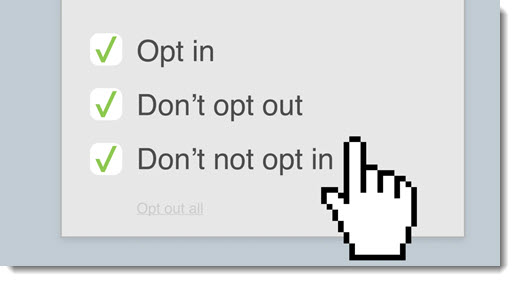
I hate to interrupt the steady flow of happiness and joy in the news, but I want to call your attention to a small way that our civilization is degrading into a dystopian hell. Once I describe it, you’ll notice it everywhere.
The web is filled with dark patterns – deliberately confusing and deceptive choices, designed to trick us into signing up for junk newsletters, subscribing to unwanted services, spamming everyone in our address book, or giving up our privacy.
The tricks aren’t new, but big companies are giving up any ethical constraints and building deception into our everyday life online, contributing to our frustration and cynicism. It feels as if every app and website is using confusing phrasing or interfaces with deceitful designs to mislead us.
Dark patterns are “tricks used in websites and apps that make you do things that you didn’t mean to, like buying or signing up for something.” The term was coined in 2010 by Harry Brignull, a user interface designer with a Ph.D. in cognitive science, who launched darkpatterns.org to spread awareness of dark patterns and to shame companies that use them. They’re not ashamed. Nine years later, dark patterns are more prevalent than ever.
We are overloaded and we skim things online, especially if we’re trying to finish something – sign up to a service, complete a purchase, or get to something we want to look at. The nudges are imperceptible but carefully chosen to manipulate what you notice and where you click. Brightly colored “agree” and “continue” buttons are obvious examples, encouraging us not to read terms and conditions that would cause us not to proceed if we understood them. Opt-out choices are in light grey on a grey background, nearly invisible, off to the side where it’s not obvious they can be clicked on.
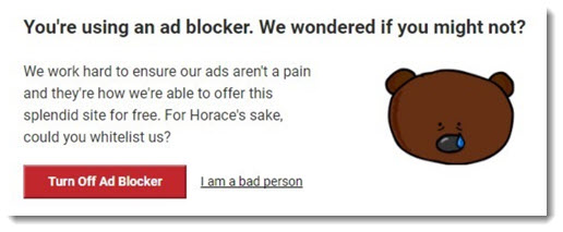
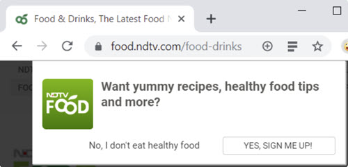
Frequently opt-out choices are presented with a sentence intended to confirmshame you, like the examples above: opting out of a spam newsletter requires you to agree that “No, I don’t eat healthy food”; you have to acknowledge “I am a bad person” to continue using an ad blocker.
This isn’t new. Advertisers and retailers have used deceptive advertising since the dawn of civilization. TechCrunch points out what has changed: “The Internet just kind of supercharges the practice and amplifies the associated ethical concerns because deception can be carried out remotely and at vast, vast scale.”
There is a list of types of dark patterns at darkpatterns.org. You can find more examples here and here and here – and probably in your own browsing today, if you notice.
I’ll give you just a few examples. There are more. Oh, dear, there are so many more.
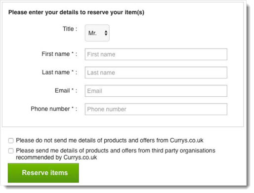
Trick questions While filling in a form, you respond to a question that tricks you into giving an answer you didn’t intend. Typically a series of checkboxes are shown, and the meaning of the boxes alternates so that ticking the first one means “opt-out” and the second means “opt-in.”
Roach motel / Forced continuity Easy to get in, hard to get out. Many services require a credit card to sign up for a 30-day free trial and then continue the subscription unless you cancel. The real darkness comes from the companies that do not provide any way to cancel online, instead requiring a phone call to a high-pressure “retention specialist.” LogMeIn deserves special notice for its steep annual price increases that are charged without warning, of course without any easy way to cancel once discovered.
Bait and switch You confidently take an action, and the result is something unforeseen.
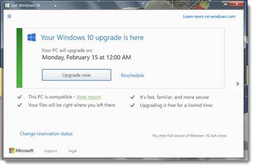
Microsoft was guilty of a particularly egregious example of this when the above screen appeared on Windows 7 computers, encouraging users to upgrade to Windows 10. Many people clicked the X in the upper right to cancel the upgrade – and then woke up to a computer that had upgraded overnight. Microsoft defied decades of user interface convention and treated the X as consent to the upgrade. It still makes me angry to think about it.
Friend spam / Privacy Zuckering LinkedIn famously paid $13 million in fines for using underhanded tactics to obtain your address book, then spamming all of your contacts with invitations to join LinkedIn. Privacy Zuckering (named after Mark Zuckerberg, naturally) covers all the different techniques companies use to try to get you to share personal information. Facebook uses a variety of triggers to get you to fill in your bio. Many “free” services work to obtain unnecessary private details before surrendering, say, a free credit score online.
Brignull points out that privacy violations now mostly take place behind the scenes in the small print hidden in terms and conditions, which authorize a service to sell your personal data to data brokers. Data brokers combine information from a multitude of sources into a profile, which they then resell. (More information about the data brokerage industry here.)
You can see other types of dark patterns at the Dark Patterns website. It looks like a list of demonic Yoga positions: Sneak Into Basket, Price Comparison Prevention, Misdirection, Hidden Costs, Disguised Ads, and more.
These are not examples of bad design. Designers can be sloppy or lazy without intending to deceive us. Dark patterns, on the other hand, are not mistakes. They’re carefully crafted with a solid understanding of human psychology, and they do not have the user’s interest in mind.
Dark patterns reflect a company’s attitude toward its customers. Superficially it works. The anger and mistrust come later. In 2016 dark patterns were wielded as weapons against democracy. Today they are a symptom of deeper problems with ethical behavior in US society in general.
In the next article, I’ll describe the way that Microsoft is using deceptive tactics to make Windows 10 setup more irritating. Be careful out there!

Trackbacks/Pingbacks