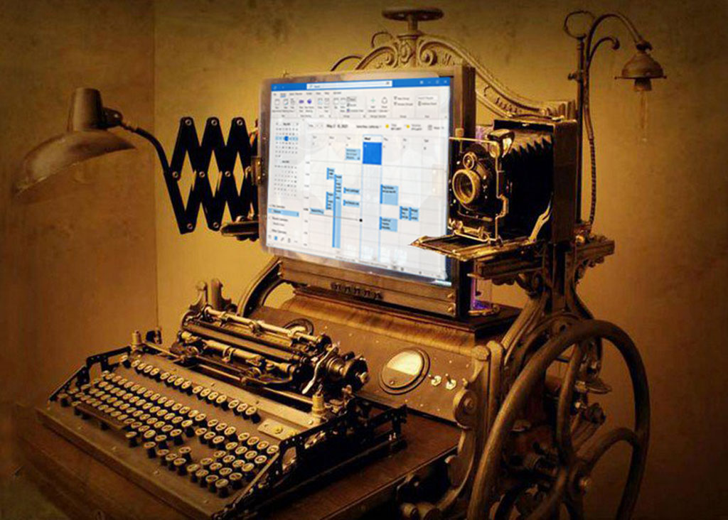
We have a complicated relationship with Microsoft Outlook, built on almost twenty-five years of daily togetherness. There are stretches where we work together happily but they're punctuated by frequent disagreements - shaking our fist at the computer, cursing when mail is missing or Outlook freezes - and occasional threats to break up. We don’t mean it. The next day we sit down, sigh, and start up Outlook for that day’s wave of incoming mail, making appointments, updating contacts, launching email attachments, never closing the Outlook window until the end of the day.
Like any long relationship, we have aged together. When is the last time you looked at Outlook, really looked at it? It’s old. Outlook has had frequent surgery over the years, sometimes to fix or remove old broken bits but more often to bolt on something new as it evolved into today’s Frankenstein monster of mismatched parts. It’s our steampunk program, an amalgam of antique and modern pieces stuck together with glue and gum and baling wire.
Microsoft never uses a good name just once so of course Outlook is not just the Windows desktop program now. It’s webmail for business, it’s an Outlook.com email address for individuals, it’s a mobile app for iPhones and a slightly different mobile app for Android and a program for Macs.
The desktop program has evolved into a client for Office 365 mailboxes. It does that very well – rock solid, fast, reliable. It’s not the best program for other kinds of mail. Oh, all the old architecture is still hanging off the back for POP3 and IMAP mailboxes, and you can still create PST files, which are just as unstable and difficult to work with as ever. If you’re still using a POP3 or IMAP mail service, (1) stop, just stop, go get a Gmail or Outlook.com address, and (2) don’t use Outlook. It’s not very good at those any more. And Gmail hates Outlook. They don’t get along at all. Don’t even try.
I’m writing this on behalf of old Windows stalwarts like me with business Office 365 mailboxes. We are wedded to the Windows desktop program. It’s habit. It’s an addiction. We can’t stop. You’ll read what I write below about all the old crap in Outlook and you’ll think: “Yeah! Time to change! I’m young! I’m flexible! I’m ready for a fresh start with something modern!”
Good for you. Want to try an interesting experiment? Log into webmail. In Chrome, click on the three dots in the upper right corner, then click on Install Outlook.
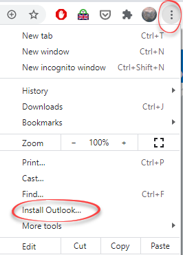
You’ll have the web version of Outlook in a separate window with a desktop shortcut that you can pin to the taskbar.
Now use it for a week instead of the usual desktop version of Outlook.
It’s good! A clean, modern version of Outlook with much of the cruft removed.
But it’s . . . different. Our muscle memory with the desktop Outlook is deeply ingrained. None of the buttons on the web version are in quite the same place and many of them are missing – which is kind of the point. Don’t be surprised if you find yourself missing some weird Outlook trick that doesn’t work in the web version. For me it’s Quick Steps, four or five single clicks that I use dozens of times a day to move mail around. So after a while I close the web version and open up the desktop version and get back to the familiar cluttered interface.
Outlook has lasted for decades while many other Microsoft programs have come and gone. Call it a blessing or a curse but Microsoft prizes backward compatibility and tries very hard to avoid disrupting companies that have adopted a Microsoft program – or which has created hooks from Outlook to another aging program. You’ll find traces of old Microsoft programs all over Outlook.
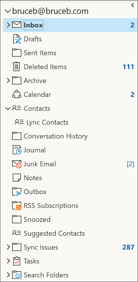
Click on the three dots at the bottom of Outlook’s left column so you can see the Folders view. You’ll see remnants scattered thru the left column of features long abandoned or only used in large enterprises – RSS Subscriptions, Conversation History, Lync Contacts, Journal, Sync Issues. When hackers steal a password and break into an Office 365 mailbox, they frequently set up a rule to divert incoming mail to the RSS Subscriptions folder because they know that no one has ever used it and no one will ever look in it until the end of time.
But there are also new mystery folders like Snoozed, which is new to me this evening – apparently you can snooze an email message in webmail (but not in the desktop program) and have it return to the inbox at a scheduled time. Who knew?
There are the buttons on the right side of the ribbon that come and go with the latest Microsoft whims. Tonight it’s Insights and Groups, a word which must mean something in this context. I wonder what?
The latest buttons are for Teams users, of course, because Microsoft’s plans to dominate the enterprise world revolve around Teams. There’s a button to share email messages to Teams and a button to start a Teams meeting.
Many things have come and gone over the years. Outlook Social Connector and the People pane were removed in 2020. You don’t recognize the name and you didn’t use them, which is the point. Yet when I click on File / Options / Add-Ins / Manage COM Add-Ins, Outlook Social Connector is still listed, along with the Sharepoint Server Colleague Import Add-In, which has not made my life richer in this universe.
There are features that move from place to place or change appearance, like the mysterious migrating Search box and its huge dropdown that covers the duplicative Search ribbon. Junk mail split down the middle and some of it became Clutter, which morphed into Focused Inbox.
You can organize mail into subfolders or you can assign categories or you can color code items, each with varying degrees of consistency, each without a guarantee that your efforts will be synced to other devices.
Outlook still splits your contacts into the main Contacts folder and the separate Address Book for fellow employees. Perhaps that becomes familiar and useful in large companies. In small businesses, “Address Book” is completely opaque, a barrier that annoys people trying to look up an email address when they click TO: in a message. I still refer back to articles that I wrote more than ten years ago to remember how to display contact folders first when you click the TO: button, and how to sort the address book by last name. Changing those settings is like visiting the past in a time machine.
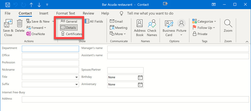
There’s a wonderful button you’ve never clicked when you open up an Outlook contact. Click on Details and marvel at the wealth of things you could have put in if you had only known – nickname, spouse/partner, birthday, anniversary. Interesting, eh? Don't start filling those in. You'll have forgotten about those fields by tomorrow.
There are almost certainly people who use everything I’ve mentioned! That’s what makes it difficult to move forward. Outlook is overstuffed and clumsy and cluttered, but there’s no easy way to a better design.
Microsoft is trying to find a way forward. There are reports that everything named “Outlook” will slowly become more similar this year, culminating in 2022 in a single Outlook that looks the same everywhere, including on the Windows desktop. I’d take that with a grain of salt; there are companies that will complain if legacy features are removed and there’s only so much that can be done to neaten up the design if everything is still there.
I don’t come to bury Outlook. I still use it every day. It might be a complicated relationship but it’s still love.

Bruce, you are right on about “muscle memory for desktop”” (aka the old ways).
I tried to use the web version – I really like it – but reluctantly installed the desktop version to get those “overly quirky” things I’d grown used to since Outlook 97. Now I use the web version when email days are light, and open up the desktop version (where I have custom views etc) when I have serious email to get through. Email volume is way down for me these days.
The thing that bugs me most in the web version is list view. I hate multi-line list view rows. To me the extra (eg 2-line) info gets in the way. You can’t avoid it in anything but no preview pane (which I use). You can’t even fully resize the preview pane to get more width on the list view.
But that’s me, and I’m old. I still like list item row height to be as compact as possible, across all apps. I imagine the big fat rows are to accommodate the fat finger experience on mobile but it bugs me.
I read all your articles Bruce and am happy to see them arrive. Thank You. Tom