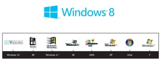
The logo for Windows 8 that was unveiled over the weekend symbolizes a lot of things that will have a deep effect on you sooner than you think. In a couple of weeks Microsoft will unveil a “consumer preview” of Windows 8 and begin a drumbeat of publicity that will lead up to the launch of the new operating system at the end of the year.
Behind the scenes, manufacturers and developers are being urged to join in a radical reimagining of the entire Windows ecosystem. It is a bet-the-company moment on a scale that is rarely attempted by any corporation.
Windows 8 is going to uproot just about everything you know about how to use a computer.
Your opinion of an operating system is largely driven by your reaction to the user interface – the look and feel of the things you see onscreen to start programs and switch between them. Windows 8 completely overhauls the Windows user interface.
Under the hood, virtually everything about Windows 8 is linked to the cloud, to mobile devices, and to home entertainment.
Windows 7 was designed as a computer operating system. It has almost no built-in features designed to integrate with the cloud or with mobile devices. Many things can be done with add-on programs from Microsoft and others but the operating system itself carried forward Microsoft’s longstanding commitment to making operating systems that run computers and only computers.
In keeping with that tradition, Windows 7 is designed to work on a large screen operated by a keyboard and mouse. It simply does not work on a small touchscreen.
In 2009, when Windows 7 was released, it was already beginning to be apparent that the end is in sight for the PC era. Apple was reaping the rewards of producing a truly great operating system expressly designed for mobile devices and Google was following in its footsteps with Android. We are living in a world that is awash in devices of all sizes and there is already a desire to use all of those devices to do our work. Our business world is not computer-centric any more.
Microsoft concluded that it could not succeed if its only meaningful product was an operating system for computers that was disconnected from the world of mobile devices.
The idea is simple and compelling. Microsoft is producing an operating system that will be consistent on computers, tablets, and phones. Once you accept that premise, a lot of what Microsoft is doing makes perfect sense.
There is no good way to make Windows 7 work on a touchscreen. The only alternative is to produce a new interface that works on a small screen using fingers and then try to scale it up so it also appeals to power users on a large screen.
It’s interesting to note that Apple’s operating system released in 2009, OS X 10.6, also had very little integration with Apple’s mobile operating system, and Apple is hard at work to integrate the look and feel of its mobile OS into the operating system on its computers. It released an early look at OS X 10.8 recently, which has the same goal of making the user interface on Apple devices consistent on all platforms.
Microsoft will not succeed against Apple if it produces a pale copy of Apple’s iOS. Microsoft already suffers from the perception that its best days are behind it; if the next release looked like an Apple wannabe, it would be deadly.
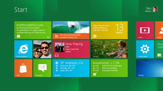
That’s where the Metro UI comes in. It is completely different than Apple’s walls of icons. For better or worse, Microsoft has chosen a UI that is built on two-dimensional squares of solid colors using the Segoe font – very simple, very European.
Take a look at the evolution of the Windows logo over the years and you’ll see the concept played out. It started flat, it gained color and dimension and shading, and now returns to something flat and simple.
With that background, let’s take a look next at the Metro UI. It bears no resemblance to any Start screen that you’ve ever seen before – and it’s likely to be what you see on the computer you buy in 2013. Big changes ahead!


Trackbacks/Pingbacks