![]()
When you open File Explorer in Windows 10, you see many things designed to make life simpler. There are so many, in fact, that the navigation pane on the left has become cluttered and confusing, exactly the opposite of what you need. Here are some tips about how to remove the “features” that don’t matter to you, to make File Explorer simpler and make you more productive.
First, some background.
What is File Explorer?
File Explorer is the window that opens whenever you’re browsing anything on your computer. When you click on Start and choose Computer or Documents or Network, it’s File Explorer that opens up. When you click on File / Open in programs to browse through your files, you see a specialized view of File Explorer. It’s the icon on the toolbar that looks like – well, what is it exactly? Ah, it’s one of those retro icons. It’s a manila folder in the kind of holder that used to be sold at Office Depot in the 1980s. Look in the Windows 10 taskbar for the icon shown above.
What is the Navigation Pane?
The navigation pane is the left column in File Explorer.
At the dawn of time, in Windows 95, File Explorer’s navigation pane had Desktop at the top. No one knew why. Somewhere there is a retired Microsoft engineer who can explain why he thought that was a good metaphor. Immediately underneath it was “My Computer,” followed by all the drives.
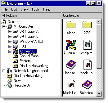
Slowly but surely, the navigation pane began to fill up. Windows Vista added Favorites. Windows 7 added Libraries and Homegroup. File syncing services like Dropbox and OneDrive began to add their own entries. Microsoft began to emphasize the core user folders – Documents, Pictures, etc. – and steer us away from browsing through the other folders on the hard drive. Each new item pushed access to the hard drives further down the list.
This is not a bad thing. It matches our experience on phones and tablets, where we typically don’t have access directly to the file system. Most people have no reason to browse files on the hard drives, and the convenience of having easy access to your user folders is exactly right. Some features, though, are rarely used and are getting in the way.
This is the way that my navigation pane looked in Windows 10 before I started to prune things away. Notice that “Quick Access” is collapsed or it would be an even longer list. I had to scroll down to get to the C: drive.
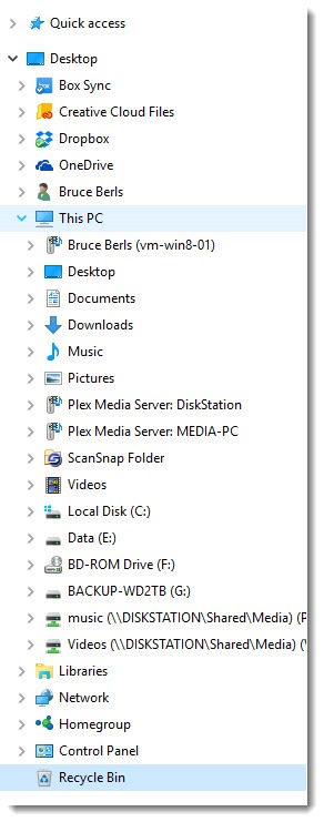
At least a few of those items can be pruned away.
Each of the following tips is optional. Don’t turn off features that you use! These are suggestions, not marching orders.
Tip: Remove multimedia devices
The Devices and Printers folder in Control Panel may include “multimedia devices.” Windows 10 automatically looks around the network for devices that are broadcasting their willingness to share media files. In my experience that is a rarely used feature and I have never found a reason for a media device to be displayed in the navigation pane. In the above picture, for example, the Plex servers are listed in the navigation pane for no reason – they’re accessed using Plex software.
Open Control Panel / Devices and Printers. Right-click on each multimedia device and click on “Remove device.” You won’t miss them.
Tip: Remove Libraries
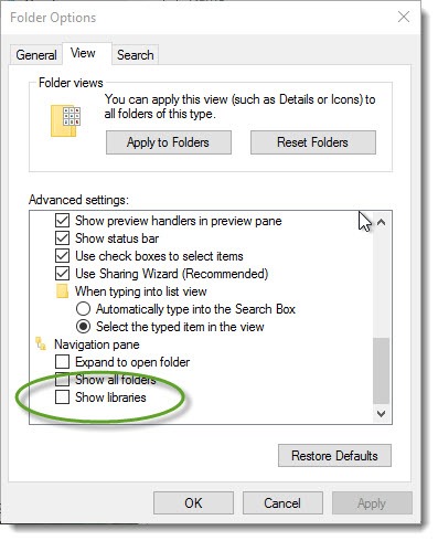
Libraries were introduced in Windows 7 as an innovative way to display multiple groups of files in a single view regardless of where they were stored. For the first time it was possible to gather, for example, personal files and office files in a single window and do searches through them together. Great idea! Unfortunately, like a lot of Microsoft’s great ideas, almost no one understood Libraries or used them to full advantage. Now they feel like an anachronism. Having Libraries in the navigation pane is a distraction for most people.
You can turn Libraries off so they’re not displayed. Open File Explorer and click on View / Options. Click the View tab, scroll down to the bottom, and clear the checkmark by “Show libraries.”
Tip: Remove Homegroup
Homegroup was another good idea in Windows 7. Theoretically it’s an easy way to bypass some of the difficulty of setting up a network with shared folders and printers. It never caught on. Like Libraries, it was poorly understood and rarely used.
If you’re not using Homegroup, you can make it disappear from the Windows navigation pane. The process is the same in Windows 7, 8, and 10. There are several steps – follow the instructions in this article.
Tip: Choose whether to display Frequently Used Folders and Recently Used Files
Now we get to very personal preferences.
Quick Access in the upper left of the navigation pane is used to store shortcuts to frequently used folders. Microsoft pre-populates it with a few default choices – Desktop, Documents, Downloads, etc.
That’s similar to “Favorites” in Windows 7 and 8. New in Windows 10, though, is that by default Microsoft adds frequently used folders to the Quick Access list, a list that is assembled and updated automatically by watching you navigate around your computer. For many people that will be genuinely helpful and you should leave it turned on.
Microsoft also added a new optional section to Quick Access that displays recently used files. Again, that might be a welcome way to navigate quickly to files that you have been working on, so you don’t have to hunt for them in your Document and Pictures folders.
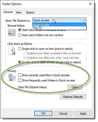
Open File Explorer and click on View / Options. The checkboxes to turn those features on and off are on the bottom of the General tab. I prefer to turn them off and use only the shortcuts I’ve placed in Quick Access, which returns it to working like Favorites in Windows 7 and 8. You should experiment to see what works for you.
Tip: Choose whether to open File Explorer to This PC or Quick Access
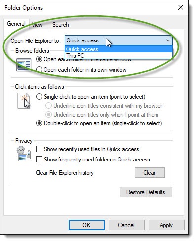
When you click on File Explorer, you can choose whether it opens to Quick Access (the shortcuts and recently used folders and files) or to This PC (your user folders and the drives). There is no right or wrong answer, so experiment to see which one is better for you. The choice is shown in the above picture; again, open File Explorer and click on View / Options to toggle back and forth.
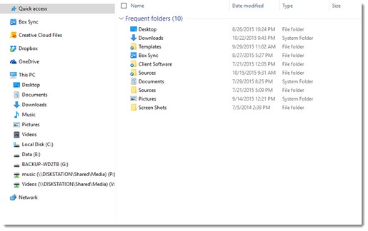
After making those changes, my copy of File Explorer looks like the above picture when I open it. Many distractions are gone and it’s easier to find what I want in the left column. Take control of Windows 10 and make it work better for you!

Good information. I read through all the comments and was surprised that I appear to be the only annoyed at the Pictures, Videos, Music folders – which remain empty and can only be removed through registry edits (and Windows 10 updates sometimes bring them back, so I have given up) – and also at the redundant listing of inserted thumb drives.
I never understood the concept of a “desktop” (mine remains empty), but the metaphor of the computer on the desktop, rather than the desktop inside the computer makes sense but only if we forget that all of these files actually do reside inside the computer and we are not ready for a totally virtual world view.
how to get rid of 3d objects and all the other junk from my documents. I dont use the my docs folder, and really dont need it.
Annoying, isn’t it? 3D Objects can only be removed by editing the registry, which should only be done if you are a confident tech person. The instructions are here.
I am having the same problem with Libraries. I uncheck Libraries, but they are still there. I also want to get rid of Quick Access. When I go to my user folder, I don’t see documents, pictures, etc., but when I open a command prompt and cd to my users folder, I do see documents, pictures, etc.
Nice little tutorial, some useful info here thanks! Now to figure out how to get rid of ONEDRIVE !
“At the dawn of time, in Windows 95, File Explorer’s navigation pane had Desktop at the top. No one knew why. ”
There is a very simple reason it was done this way. IIRC, at that time. MacOS claimed greater “user friendliness” than Windows due to (among other things) having a desktop, which Windows 3.1 and NT 3.5.1 both lacked: they used the “Program Manager” paradigm, which simply didn’t support a desktop.
So when Windows 95 and NT 4 released in 1995, with Explorer rather than Program Manager, Microsoft operating systems got a desktop. And then possibly as a response to the MacOS camp it makes total sense for them to place it as the topmost item in Explorer.
As a purely personal opinion, I will comment that the addition of the desktop to those early versions of Windows was IMEHO one of the best user interface improvements made. I still shudder when I think how hideous it was using Program Manager vs Explorer.
As another note, I can’t say for certain when the change started, but we seem to be headed to a “This PC”-centric model nowadays, certainly that’s how Windows 10 appears to be. Not that it really matters, as long as there is an easily accessible location from which everything else can be found, very little changes if that location is the desktop or “This PC”.
Even with that history – and my thanks for bringing the long view – I still remember the conceptual confusion for putting Desktop at the top as a container for “My Computer.” It just isn’t a good metaphor!
I wrote this article two years ago and since then my File Explorer left column has accumulated more detritus. I was scrolling down today, trying to reach the C: drive and realized I was scrolling past “3D Objects” at the top of the list under “This PC.” I know, all I have to do is ignore it, but now I will never NOT notice that, every time I scroll that left column. . .
Great Post. It helped in removing the windows media sharing services from Navigation Pane.
Thanks a lot….
Any idea on how to remove the My User folder from the navigation pane as well?
I don’t see anything labeled that way in my navigation pane. The user folders are built very deeply into Windows. I don’t know any way to conceal them.
You can remove Amazon Drive from Explorer Navigation Pane using the registry editor. This link should help.
http://www.winhelponline.com/blog/remove-amazon-drive-explorer-navigation-pane/
@Bohumir – to get rid of the useless Amazon Drive, I searched the registry for “amazon drive” and for each pertinent result I first exported the key to be safe then deleted them, and this got rid of it…
GOD please!
I uninstalled Amazon Drive, but it sticked to the navigation bar on my file explorer. There are options (as .reg records) for hiding/restoring onedrive and google drive. But nobody cares amazon drive, so there’s no option for me.
I’m noticing that under “Quick Access” it constantly re-arranges the order of folders, depending on which was opened last. It would be great to have these in a fixed position (like “Favorites” in previous versions of explorer). Can anyone help with this?? Thanks, Brandon.
There are options to show “recently used files” and “frequently used folders” in Quick Access. Those are always going to be refreshing and jumping around. Try clearing those check boxes (View / Options / General), then pinning the folders you want in Quick Access. (You can drag them from the right pane, just make sure to drop them in between two other items in Quick Access, so you don’t wind up copying things by mistake.) Those are like the old Favorites and should stay fixed in place.
Thank you so so much 🙂
Sorry Bruce, I should have done that. Yes, I can see ‘Libraries’ in the long cluttered one but not in the shorter (rather small scale) one. But I can’t get rid of it from mine.
Chris
Thanks Bruce for your reply. Just to be certain what you mean by “I can turn Libraries on and off”, whatever settings I use, when I open File Explorer, ‘Libraries’ appears in the Navigation pane, expanded to the next level of items. I can close it to only show ‘Libraries’, but I can’t find any way to stop ‘Libraries’ showing, never mind appearing when File Explorer is opened. Please can you confirm that “I can turn Libraries on and off” means that when it’s off, you don’t see it at all!
With thanks,
Chris
Right. Compare the two Win10 screenshots in the article – the checkbox toggles Libraries from appearing (the top shot) and not appearing (bottom shot).
For me ‘Libraries’ in the Windows 10 File Explorer Navigation Pane is a confusing distraction. Usually I want to expand ‘Documents’ or ‘Pictures’ in ‘This PC’ or ‘Documents’ in ‘One Drive’. I see ‘Documents’ or ‘Pictures’ in ‘Libraries’, mistakenly try to expand it, and get another ‘Documents’ or ‘Pictures’ a level further down before I can make any progress. I’ve unticked ‘Show libraries’ in the [View] {Navigation pane} drop-down menu, and ‘Show libraries’ in “Folder Options” [View], but ‘Libraries’ still appears in my Navigation pane. How can I hide it?
I’m not sure why you’re getting that result – I can turn Libraries on and off with the Folder Options / View checkbox. Still there after you do that? No idea. Strange. Sorry – good luck!
I also have two labeled OneDrive for Business. One is the correct folder with a (1) behind it, and other other without the 1 but is linked to my user folder. I can’t figure out a way to remove it from the navpane. Plus, it is linked to the wrong location anyway.
After disconnecting OneDrive, it still shows in the navpane. So, when I click it gives the location not found error, but I don’t have an option to remove it from the navpane.
Any help is appreciated!
I don’t have any experience but a couple of articles appeared this week with tips for turning off OneDrive in Windows 10. See if this helps: http://www.howtogeek.com/225973/how-to-disable-onedrive-and-remove-it-from-file-explorer-on-windows-10/ Some of that information comes from a Microsoft support article: https://support.office.com/en-US/article/Turn-off-or-uninstall-OneDrive-f32a17ce-3336-40fe-9c38-6efb09f944b0 Good luck!
After I disabled OneDrive how do I change the folder path on the navigation pane???like “Documents” and “Pictures”? they are somehow still linked to “USER\OneDrive\Documents” and “Pictures” respectively. so when I click on the, I get a Location Not Available error…..
Right-click on “Documents” or “Pictures” and click on “Location.” You can reset to the default (which is probably the non-OneDrive folder) or manually browse to the right place, usually the folder under C:\Users\(yourname). That should put things right. Good luck!
Perhaps you know the cause of this annoying mystery. Most of the time, but not all of the time, when I open a folder in File Explorer, the Navigation Pane scrolls down to the bottom, rather than staying put, with the open folder displayed (along with the sequence of folders “above” and “below” it. How can I make this “auto-scroll-down” stop???
Thanks.
Steve Berer
Interesting! I don’t know for sure. But check a couple of settings. Open File Explorer and click on View / Options. On the View tab, see if you have a checkmark on “Restore previous folder windows at logon.” It’s not checked by default and might have something to do with it. http://www.thewindowsclub.com/restore-previously-open-folders-at-logon
If not, toggle back and forth in the setting under Options / General / Open File Explorer to (This PC or Quick Access). See if it makes any difference. Good luck!
Brilliant, my friend. You are a life saver.